flex彈性布局
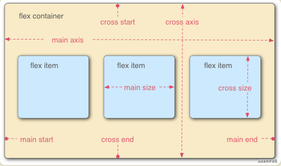
定義: Flex 布局的元素,稱為 Flex 容器(flex container),簡稱"容器"。它的所有子元素自動成為容器成員,稱為 Flex 項目
容器默認存在兩根軸:水平的主軸( main axis )和垂直的交叉軸( cross axis )。
主軸的開始位置(與邊框的交叉點)叫做 main start ,結束位置叫做 main end ;交叉軸的開始位置叫做 cross start ,結束位置叫做 cross end 。
項目默認沿主軸排列。單個項目占據的主軸空間叫做 main size ,占據的交叉軸空間叫做 cross size 。
彈性布局如何使用:只需要給容器設置 display:flex
容器屬性
.box
{
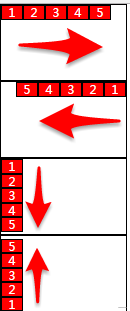
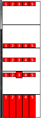
flex-direction: row | row-reverse | column | column-reverse;
}
row
row-reverse
column
column-reverse
<style>
    ul:nth-of-type(1){ flex-direction:row;}
    ul:nth-of-type(2){ flex-direction:row-reverse;}
    ul:nth-of-type(3){ flex-direction:column;}
    ul:nth-of-type(4){ flex-direction:column-reverse;}
</style>
.box
{
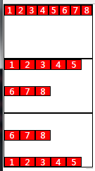
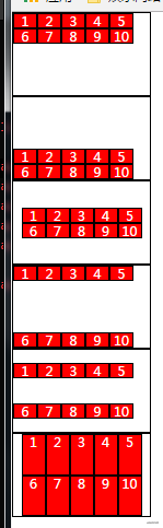
flex-wrap : nowrap| wrap | wrap-reverse ;
}
<style>
    ul:nth-of-type(1){flex-wrap:nowrap;}
    ul:nth-of-type(2){flex-wrap:wrap;}
    ul:nth-of-type(3){flex-wrap:wrap-reverse;}
</style>
.box
{
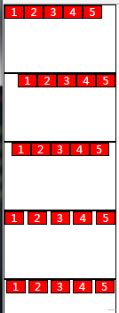
justify-content: flex-start | flex-end | center | space-between | space-around;
}
flex-start
flex-end
center
space-between
space-around
<style>
    ul:nth-of-type(1){justify-content:flex-start;}
    ul:nth-of-type(2){justify-content:flex-end;}
    ul:nth-of-type(3){justify-content:center;}
    ul:nth-of-type(4){justify-content:space-between;}
    ul:nth-of-type(5){justify-content:space-around;}
</style>
.box { align-items: flex-start | flex-end | center | baseline | stretch;}
flex-start
flex-end
center
baseline
stretch
<style>
    ul:nth-of-type(1){align-items:flex-start;}
    ul:nth-of-type(2){align-items:flex-end;}
    ul:nth-of-type(3){align-items:center;}
    ul:nth-of-type(4){align-items:baseline;}
    ul li{ height:auto;}
    ul:nth-of-type(5){align-items:stretch;}
</style>
align-content 屬性定義了多根軸線的對齊方式。如果項目只有一根軸線,該屬性不起作用。
.box {align-content: flex-start | flex-end | center | space-between | space-around | stretch;}
flex-start
flex-end
center
space-between
space-around
stretch
<style>
    ul:nth-of-type(1){ flex-wrap:wrap; align-content:flex-start;}
    ul:nth-of-type(2){ flex-wrap:wrap; align-content:flex-end;}
    ul:nth-of-type(3){ flex-wrap:wrap; align-content:center;justify-content:center;}
    ul:nth-of-type(4){ flex-wrap:wrap; align-content:space-between;}
    ul:nth-of-type(5){ flex-wrap:wrap; align-content:space-around;}
    ul li{ height:auto;}
    ul:nth-of-type(6){ flex-wrap:wrap;align-content: stretch; justify-content:center;}
</style>
簡寫方式:
flex-flow :
flex-flow 屬性是 flex-direction 屬性和 flex-wrap 屬性的簡寫形式,默認值為 row nowrap 。 .
box {flex-flow: <flex-direction> || <flex-wrap>;}
項目屬性
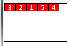
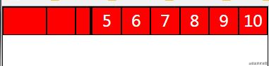
order 屬性定義項目的排列順序。數值越小,排列越靠前,默認為 0 。
.item {order: <integer>;}
<style>
    ul li:nth-of-type(3){order:1;}
    ul li:nth-of-type(2){order:2;}
    ul li:nth-of-type(1){order:3;}
    ul li:nth-of-type(5){order:4;}
    ul li:nth-of-type(4){order:5;}
</style>
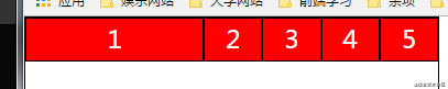
flex-grow 屬性定義項目的放大比例,默認為 0 ,即如果存在剩余空間,也不放大。 如果所有項目的 flex-grow 屬性都為 1 ,則它們將等分剩余空間(如果有的話)。如果一個項目的 flex-grow 屬性為 2 ,其他項目都為 1 ,則前者占據的剩余空間將比其他項多一倍。
.item { flex-grow: <number>; /* default 0 */}
<style>
    ul li:nth-of-type(1){ flex-grow:1;}
    ul li:nth-of-type(2){ flex-grow:1;}
</style>
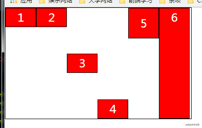
flex-shrink 屬性定義了項目的縮小比例,默認為 1 ,即如果空間不足,該項目將縮小。
如果所有項目的 flex-shrink 屬性都為 1 ,當空間不足時,都將等比例縮小。
如果一個項目的 flex-shrink 屬性為 0 ,其他項目都為 1 ,則空間不足時,前者不縮小。
負值對該屬性無效。
.item { flex-shrink: <number>; /* default 1 */}
<style>
    ul li:nth-of-type(1){flex-shrink:0;}
    ul li:nth-of-type(2){flex-shrink:1;}
    ul li:nth-of-type(3){flex-shrink:2;}
    ul li:nth-of-type(4){flex-shrink:3;}
</style>
flex-basis 屬性定義了在分配多余空間之前,項目占據的主軸空間( main size )。瀏覽器根據這個屬性,計算主軸是否有多余空間。它的默認值為 auto ,即項目的本來大小。它可以設為跟width或height屬性一樣的值(比如 350px ),則項目將占據固定空間。
.item { flex-basis: <length> | auto; /* default auto */}
<style>
    ul li:nth-of-type(1){ flex-basis:50%;}
</style>
align-self 屬性允許單個項目有與其他項目不一樣的對齊方式,可覆蓋 align-items 屬性。默認值為 auto ,表示繼承父元素的 align-items 屬性,如果沒有父元素,則等同于 stretch 。
.item { align-self: auto | flex-start | flex-end | center | baseline | stretch;}
<style>
    ul{align-items:flex-start;}
    ul li{height: auto}
    ul li:nth-of-type(1){ align-self:auto;}
    ul li:nth-of-type(2){ align-self:flex-start;}
    ul li:nth-of-type(3){ align-self:center; }
    ul li:nth-of-type(4){ align-self:flex-end;}
    ul li:nth-of-type(5){ align-self:baseline;line-height: 80px;}
    ul li:nth-of-type(6){ align-self:stretch;}
</style>
flex 屬性
flex 屬性是 flex-grow , flex-shrink 和 flex-basis 的簡寫,默認值為 0 1 auto 。后兩個屬性可選。
.item { flex: none | [ <'flex-grow'> <'flex-shrink'>? || <'flex-basis'> ]}
該屬性有兩個快捷值: auto (1 1 auto) 和 none (0 0 auto) 。
建議優先使用這個屬性,而不是單獨寫三個分離的屬性,因為瀏覽器會推算相關值。
媒體查詢
<!DOCTYPE html>
<html>

<head>
    <title></title>
</head>

<body>
</body>
<script type="text/javascript">
/*
viewport
定義:viewport就是設備的屏幕上能用來顯示我們的網頁的那一塊區域,css中的1px并不等于設備的1px:因為像素密度不同
    layout viewport:布局視口
    一般移動設備的瀏覽器都默認設置了一個viewport元標簽,定義一個虛擬的layout viewport,用于解決早期頁面手機上顯示的問題
    visual viewport :可視視口
    設置物理屏幕的可視區域,屏幕顯示的物理像素,同樣的屏幕,像素密度大的設備,可現實的像素會更多
    ideal viewport   :理想視口
    通過metab標簽來得到理想視口
    示例:<meta name="viewport" content="width=device-width, initial-scale=1.0 maximum-scale=1.0">

* 移動端布局
    * meta標簽的content屬性的值
    * width=device-width,height=device-height,讓當前的viewport寬度,高度等于設備的寬度,高度,也可以設置一個固定的值,盡量不使用height
    * initial-scale=1.0;初始化縮放比例:0.25-1.0
    * maximum-sacle=1.0;設置最大縮放比例:0.25-1.0
    * minimum-scale=1.0;設置最小縮比例:0.25-1.0
    * user-scalable=no;是否允許用戶縮放,默認為yes,如果設置為no:那么minimax-scale,與maximum-scale將被忽略,因為不允許縮放
    * 實例:
    * <meta id="viewport" name="viewport" content="width=device-width, initial-scale=1.0, maximum-scale=1, user-scalable=no">

* 移動端手勢事件
    * 與pc端事件差異對比
    * pc端的mousemove,mouseup,mousedown,在移動端會失效或者不正常
    * pc端的click事件可以使用,|   不要說300ms問題   |  但是會有300ms延遲問題:手機早期:用于斷定是否是雙擊放大縮小
    *
    * 移動端事件
    * touchstart:手指按下觸發
    * touchmove:手指移動時觸發
    * touched:手指離開時觸發
    * touchcancel:事件被打斷是觸發
    *
    * 移動端事件執行順序:touchstart->touchmove->touched->click
    *
    * touchEvent	  對象與pc端事件的差異對比,多了三個TouchList屬性
    * touches         位于當前屏幕上的所有手指的一個列表
    * targetTouches   位于當前DOM對象上的手指的一個列表
    * changedTouhes   保存狀態改變的手指對象的一個列表
    *
    * 每個TouchList中有多個對象,每個Touch對象的對象屬性
    * screenX 相對屏幕左邊的距離
    * screenY 相對屏幕上邊的距離
    * clientX  相對瀏覽器左邊的距離
    * clientY  相對瀏覽器上邊的距離
    * pageX  相對頁面左邊的距離
    * pageY  相對頁面上邊的距離
    * target  觸摸的當前元素
    * identifier 當前觸摸對象的id,用于辨別手指
    * radiusX, radiusY  手指觸摸的范圍
*/
</script>
<style type="text/css">
/*媒體查詢一*/
* {
    margin: 0;
    padding: 0;
}

body {
    background-color: pink;
}

/*使用@media query可以實現響應式布局效果,會根據不同的條件,去設置不同的樣式*/
/*screen表示屏幕,min-width:1200px 表示寬度最小值是1200px換句話說就是當屏幕寬度大于等于1200px的時候是什么樣式*/
@media only screen and (min-width:1200px) {

    /*這里寫樣式*/
    body {
        background-color: red;
    }
}

/*當屏幕寬度,大于800,小于1199顯示的樣式*/
@media only screen and (min-width: 800px) and (max-width:1199px) {
    body {
        background-color: aqua;
    }
}

/*當屏幕寬度,大于400,小于640顯示的樣式*/
/*//如果在媒體查詢中沒有銜接上的部分,會顯示默認部分*/
@media only screen and (min-width: 400px) and (max-width: 640px) {
    body {
        background-color: yellow;
    }
}
</style>
<!--
	媒體查詢二
	<meta name="viewport" content="width=device-width, initial-scale=1.0 maximum-scale=1.0">
	<link rel="stylesheet" href="css/m320.css" media="only screen and (max-width:320px)">
	<link rel="stylesheet" href="css/m375.css" media="only screen and (min-width:321px) and (max-width:375px)">
	<link rel="stylesheet" href="css/m414.css" media="only screen and (min-width:376px) and (max-width:414px)">
 -->

</html>
移動端點擊事件
<!DOCTYPE html>
<html>

<head>
    <title></title>
</head>

<body>
</body>
<script type="text/javascript">
// 移動端手勢
var box = document.querySelector('#box')
//pc端的click事件
box.addEventListener('click', function(e) {
    console.log('===========click============');
    console.log(e);
});
//手指按下
box.addEventListener('touchstart', function(e) {
    console.log('===========touchstart============');
    //            Fn(e);
})
//手指移動
box.addEventListener('touchmove', function(e) {
    console.log('==========touchmove===========');
    Fn(e);
})
//手指抬起
box.addEventListener('touchend', function() {
    console.log('============touchend==========');
});
//被打斷后出發
box.addEventListener('touchcancel', function() {
    alert('============被打斷了================');
})

var touchesH1 = document.querySelector('#box h1:nth-of-type(1)');
var targettouchesH1 = document.querySelector('#box h1:nth-of-type(2)');
var changetouchesH1 = document.querySelector('#box h1:nth-of-type(3)');

function Fn(e) {
    touchesH1.innerHTML = 'touches' + e.touches.length;
    targettouchesH1.innerHTML = 'targettouches' + e.targetTouches.length;
    changetouchesH1.innerHTML = 'changetouches' + e.changedTouches.length;

}

// 使用touch庫(移動端)
$('#box').tap(function() {
    console.log('====tap====')
})
$('#box').longTap(function() {
    console.log('====long tap====')
})
$('#box').doubleTap(function() {
    console.log('====double tap====')
})

$('#box').swiperLeft(function() {
    console.log('====left tap====')
})

// 使用zepto庫(移動端)
$("#box").tap(function() {
    console.log('======tap=========');
})
$("#box").singleTap(function() {
    console.log('======singleTap=========');
})
$("#box").doubleTap(function() {
    console.log('======doubleTap=========');
})
$("#box").longTap(function() {
    console.log('======longTap=========');
})
$("#box").swipe(function() {
    console.log('======swipeTap=========');
})


// 自定義Touch事件庫
//封裝自定義的touch事件庫
//注意:這里前面一個分號,是為了防止引用其他庫的時候,那個庫沒有分號結尾,以后代碼壓縮的話容易出問題
;
(function(window, undefined) {
    var query = function(selector) {
        return query.fn.init(selector);
    };

    query.fn = query.prototype = {
        //初始化方法,就是模擬獲取元素的方法,但這里獲取的不是真正的元素,真正的元素存取在與整個對象的element屬性中
        init: function(selector) {
            if (typeof selector == 'string') {
                this.element = document.querySelector(selector);
                return this;
            }
        },

        //單擊,handler是回調函數,就是單擊之后做出的響應功能
        tap: function(handler) {
            this.element.addEventListener('touchstart', touchFn);
            this.element.addEventListener('touchend', touchFn);

            //用來區分和長按的時間變量,做一個時間差判斷
            var startTime, endTime;

            function touchFn(e) {
                switch (e.type) {
                    case 'touchstart':
                        //按下的時候記錄一個時間
                        startTime = new Date().getTime();
                        break;
                    case 'touchend':
                        //離開的事件記錄一個時間
                        endTime = new Date().getTime();
                        if (endTime - startTime < 500) {
                            //在手勢離開的時候,回調
                            handler();
                        }

                        break;

                }
            }
        },
        //長按
        longTap: function(handler) {
            this.element.addEventListener('touchstart', touchFn);
            this.element.addEventListener('touchend', touchFn);
            //這個移動事件是為了解決與其他事件沖突問題
            this.element.addEventListener('touchmove', touchFn);
            var timeId;

            function touchFn(e) {
                switch (e.type) {
                    case 'touchstart':
                        //按下達到500ms,我們認為是長按
                        clearTimeout(timeId);

                        timeId = setTimeout(function() {
                            handler();
                        }, 500);
                        break;
                    case 'touchend':
                        //離開的時候清空定時器
                        clearTimeout(timeId);
                        break;
                    case 'touchmove':
                        //一旦移動了就清空長按定時器
                        clearTimeout(timeId);
                        break;

                }
            }
        },
        //雙擊
        doubleTap: function(handler) {
            this.element.addEventListener('touchstart', touchFn);
            this.element.addEventListener('touchend', touchFn);

            //記錄次數
            var tapCount = 0,
                timeId;

            function touchFn(e) {
                switch (e.type) {
                    case 'touchstart':
                        //按下的時候記錄一次
                        tapCount++;
                        //剛進來的時候,就清空一下定時器
                        clearTimeout(timeId);

                        timeId = setTimeout(function() {
                            //如果達到500ms,我們認為就不是雙擊,要把tapCount清零
                            tapCount = 0;
                        }, 500);
                        break;
                    case 'touchend':
                        //離開的時候清空定時器
                        if (tapCount == 2) {
                            //當按下2次的時候,才算雙擊
                            handler();
                            //觸發雙擊之后,點擊次數清零
                            tapCount = 0;
                            //清空定時器
                            clearTimeout(timeId);
                        }

                        break;

                }
            }
        },
        //左滑
        swiperLeft: function(handler) {
            this.element.addEventListener('touchstart', touchFn);
            this.element.addEventListener('touchend', touchFn);

            //手勢觸發的坐標
            var startX, startY, endX, endY;

            function touchFn(e) {
                switch (e.type) {
                    case 'touchstart':
                        //按下的時候記錄起始的坐標
                        startX = e.targetTouches[0].pageX;
                        startY = e.targetTouches[0].pageY;
                        break;
                    case 'touchend':
                        //離開的時候記錄下終止坐標
                        endX = e.changedTouches[0].pageX;
                        endY = e.changedTouches[0].pageY;
                        //判斷是否是左右滑&& //判斷具體是左滑,還是右滑
                        if (Math.abs(endX - startX) >= Math.abs(endY - startY) && (startX - endX) >= 25) {
                            handler();
                        }
                        break;

                }
            }
        },
    }
    query.fn.init.prototype = query.fn;
    window.$ = window.query = query;
}(window, undefined))
</script>

</html>
到此這篇關于CSS彈性布局FLEX,媒體查詢及移動端點擊事件的實現的文章就介紹到這了,更多相關CSS彈性布局內容請搜索腳本之家以前的文章或繼續瀏覽下面的相關文章,希望大家以后多多支持腳本之家!
