前言
為了按照常規WEB布局,這里全部采用擁有header和footer模式進行左中右布局編寫。
第一種:基于float實現
實現思路
常規思路,使左右兩個Aside分別浮動至左右兩側即可
代碼實現
<!-- HTML部分 -->
<div class="container">
  <!-- 頂部Header -->
  <header>這里是頭部</header>
  <!-- 中間aside及content -->
  <div class="middle clearfix">
    <aside class="left"></aside>
    <aside class="right"></aside>
    <!-- 中間content顯示內容 為了防止將右側擠下去故放置在右側欄下方 -->
    <div class="content">這里是內容</div>
  </div>
  <!-- 底部Footer -->
  <footer></footer>
</div>
<!-- CSS部分 -->
<style lang="scss">
  * {
    margin: 0;
    padding: 0;
  }

  .clearfix {
    zoom: 1;
    &::after {
      display: block;
      content: ' ';
      clear:both
    }
  }

  html, body {
    width: 100%;
    height: 100%
    }
    .container {
      width: 100%
      height: 100%
      header {
        height: 80px;
        background: rgba(0, 0, 0, 0.5)
      }
      footer {
        height: 80px;
        background: rgba(0, 0, 0, 0.5)
      }
      .middle {
        height: calc(100% - 80px - 80px)
        aside {
          height: 100%;
          width: 300px;
          background: rgba(156, 154, 249, 1)
        }
        .left {
          float: left
        }
        .right: {
          float: right
        }
      }
    }
  }
</style>
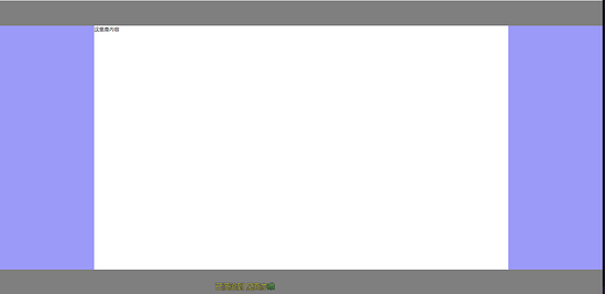
實現效果
第二種:基于position:absolute實現
實現思路
為中間三欄父級賦予position: relative,賦予左右Aside position: absolute,并且分別賦予left: 0 right: 0 width:自定義值,賦予中間content left,right 分別等于左右width即可
代碼實現
<!-- HTML相關代碼 -->
<div class="container">
  <!-- 頂部Header -->
  <header></header>
  <div class="middle">
    <!-- 左側Aside -->
    <aside class="left"></aside>
    <!-- 中間content內容 -->
    <div class="content">這里是內容</div>
    <!-- 右側Aside -->
    <aside class="right"></aside>
  </div>
  <!-- 底部Footer -->
  <footer></footer>
</div>
<!-- CSS相關代碼 -->
<style lang="scss">
  * {
    margin: 0;
    padding: 0
  }

  html, body {
    width: 100%;
    height: 100%
  }

  .container {
    width: 100%;
    height: 100%;
    header {
      height: 80px;
      background: rgba(0, 0, 0, 0.5);
    }
    footer {
      height: 80px;
      background: rgba(0, 0, 0, 0.5);
    }
    .middle {
      height: calc(100% - 80px - 80px);
      position: relative;
      aside,
      .content {
        position: absolute;
      }
      .left {
        width: 300px;
        background: rgba(156, 154, 249, 1);
        left: 0;
        height: 100%;
      }
      .right {
        width: 300px;
        background: rgba(156, 154, 249, 1);
        right: 0;
        height: 100%;
      }
      .content {
        left: 300px;
        right: 300px;
      }
    }
  }
</style>
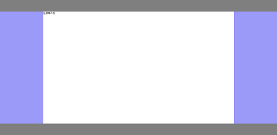
實現效果

第三種:基于display:flex實現
實現思路
賦予左中右三列父級display: flex,賦予左右Aside width自定義,賦予中間content flex:1即可
代碼實現
<!-- HTML相關代碼 -->
<div class="container">
  <!-- 頂部Header -->
  <header></header>
  <div class="middle">
    <!-- 左側Aside -->
    <aside class="left"></aside>
    <!-- 中間content內容 -->
    <div class="content">這里是內容</div>
    <!-- 右側Aside -->
    <aside class="right"></aside>
  </div>
  <!-- 底部Footer -->
  <footer></footer>
</div>
<!-- CSS部分 -->
<style lang="scss">
  * {
    margin: 0;
    padding: 0;
  }

  html, body {
    width: 100%;
    height: 100%;
  }

  .container {
    header {
      height: 80px;
      background: rgba(0, 0, 0, 0.5);
    }
    footer {
      height: 80px;
      background: rgba(0, 0, 0, 0.5);
    }
    .middle {
      display: flex;
      height: calc(100% - 80px - 80px);
      aside {
        width: 300px;
        background: rgba(156, 154, 249, 1);
      }
      .content: {
        flex: 1;
      }
    }
  }
</style>
實現效果

第四種:基于display: table實現
實現思路
賦予左中右三列父級display: table, width: 100%,分別賦予左中右三列display: table-cell,分別賦予左右Aside width即可。
代碼實現
<!-- HTML相關代碼 -->
<div class="container">
  <!-- 頂部Header -->
  <header></header>
  <div class="middle">
    <!-- 左側Aside -->
    <aside class="left"></aside>
    <!-- 中間content內容 -->
    <div class="content">這里是內容</div>
    <!-- 右側Aside -->
    <aside class="right"></aside>
  </div>
  <!-- 底部Footer -->
  <footer></footer>
</div>
<!-- CSS部分 -->
<style lang="scss">
  * {
    margin: 0;
    padding: 0;
  }

  html, body {
    width: 100%;
    height: 100%;
  }

  .container {
    header {
      height: 80px;
      background: rgba(0, 0, 0, 0.5);
    }
    footer {
      height: 80px;
      background: rgba(0, 0, 0, 0.5);
    }
    .middle {
      display: table;
      width: 100%
      height: calc(100% - 80px - 80px);
      aside {
        width: 300px;
        display: table-cell;
        background: rgba(156, 154, 249, 1);
      }
      .content: {
        display: table-cell;
      }
    }
  }
</style>
實現效果
第五種:基于display: grid實現
實現思路
賦予左中右三列父級display: grid,并且使用grid-template-columns: 300px auto 300px,將其分為寬為300px、auto、300px三列布局即可。
代碼實現
<!-- HTML相關代碼 -->
<div class="container">
  <!-- 頂部Header -->
  <header></header>
  <div class="middle">
    <!-- 左側Aside -->
    <aside class="left"></aside>
    <!-- 中間content內容 -->
    <div class="content">這里是內容</div>
    <!-- 右側Aside -->
    <aside class="right"></aside>
  </div>
  <!-- 底部Footer -->
  <footer></footer>
</div>
<!-- CSS部分 -->
<style lang="scss">
  * {
    margin: 0;
    padding: 0;
  }

  html, body {
    width: 100%;
    height: 100%;
  }

  .container {
    header {
      height: 80px;
      background: rgba(0, 0, 0, 0.5);
    }
    footer {
      height: 80px;
      background: rgba(0, 0, 0, 0.5);
    }
    .middle {
      display: grid;
      grid-template-columns: 300px auto 300px;
      height: calc(100% - 80px - 80px);
      aside {
        background: rgba(156, 154, 249, 1);
      }
    }
  }
</style>
實現效果

到此這篇關于詳解CSS多種三列自適應布局實現的文章就介紹到這了,更多相關CSS 三列自適應布局內容請搜索腳本之家以前的文章或繼續瀏覽下面的相關文章,希望大家以后多多支持腳本之家!
