在 CSS 中,文字算是我們天天會打交道的一大類了���,有了文字��,則必不可少一些文字裝飾�。
本文將講講兩個比較新的文字裝飾的概念 text-decoration 與 text-emphasis�,在最后,還會講解使用 background 模擬文字下劃線的一些有趣的動效���。
text-decoration 文字裝飾
text-decoration 意為文字裝飾,在很早的規范 CSS Level 2 (Revision 1) -- text-decoration 就已經存在了����。譬如我們非常熟知的下劃線 text-decoration: underline��。
p {
    text-decoration: underline;
}

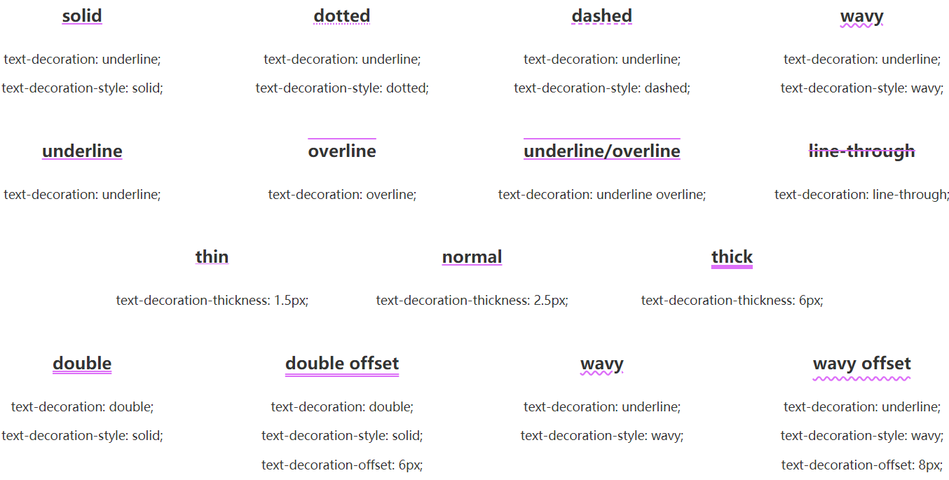
而到了比較新的 CSS Text Decoration Module Level 3 - text-decoration,text-decoration 得到了比較大的豐富更新,演化出了 text-decoration-line, text-decoration-color, text-decoration-style���,和還未成為標準的 text-decoration-thickness 等屬性,是它們的縮寫。
其中:
-
text-decoration-line:控制用于設置元素中的文本的修飾類型,是在文本下方���、上方還是貫穿文本
-
text-decoration-style:不僅僅是實線 solid����,類似于 border-style,還支持雙實線 double�、點劃線 dotted����、虛線 dashed 以及非常有意思的 wavy 波浪線
-
text-decoration-color:這個好理解�����,控制顏色
-
text-decoration-thickness:控制修飾線的粗細
這里有張非常好的圖�����,幫助大家快速理解:
CodePen Demo -- Text-decoration Demo
text-decoration-line 可以同時設置
有意思的一點是�����,text-decoration-line 可以同時設置。
p {
    text-decoration-line: overline underline line-through;
}

我們可以得到上中下三條線����。
text-decoration 可以進行過渡與動畫
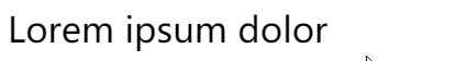
text-decoration 的每個值都是可以進行過渡與動畫的��。合理利用,在一些文本強調的地方,非常有用�。
<p class="transition">Lorem ipsum dolor</p>
.transition {
    text-decoration-line: underline;
    text-decoration-color: transparent;
    text-decoration-thickness: 0.1em;
    cursor: pointer;
    transition: .5s;

    &:hover {
        text-decoration-color: pink;
        text-decoration-thickness: 0.15em;
        color: pink;
    }
}
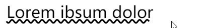
配合另外一個屬性 text-underline-offset��,我們還可以實現如下圖這樣有趣的效果:

當然,上述的例子中使用了 text-underline-offset 的變換,但是本身 CSS 是不支持 text-underline-offset 的過渡動畫的�����,這里借助了 CSS @property 巧妙的實現了 text-underline-offset 的過渡動畫�,感興趣的可以具體了解下 CSS @property 的用法�����。
CodePen Demo -- 文字下劃線過渡動畫效果
text-decoration-color 與 color 分離
text-decoration-color 與 color 是可以不一樣的��,類似于這樣。
.color {
    text-decoration-style: wavy;
    cursor: pointer;
    transition: .5s;

    &:hover {
        color: transparent;
        text-decoration-color: pink;
    }
}
有意思�,經過這樣����,我們其實得到了一條波浪線��。
如果我們把 wavy 下劃線加給元素的偽元素��,然后在 hover 的時候添加一個動畫,讓波浪線動起來����,得到一個非常好的強調 hover 效果:
<p class="animation" data-content="Lorem ibsum dolor Lorem ibsum dolor">Lorem ibsum dolor</p>
.animation {
    position: relative;
    text-decoration: none;
    overflow: hidden;
    cursor: pointer;
    line-height: 2;

    &::before {
        content: attr(data-content);
        position: absolute;
        top: 0;
        left: 0;
        color: transparent;
        white-space: nowrap;
        text-decoration-line: underline;
        text-decoration-style: wavy;
        text-decoration-color: #000;
        z-index: -1;
    }
    &:hover::before {
        animation: move 3s infinite linear;
    }
}
@keyframes move {
    100% {
        transform: translate(-209px, 0);
    }
}
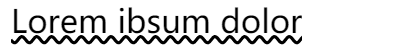
我們利用偽元素添加了一段長于文本本身的文本�,并且顏色為透明��,但是設置了波浪線的顏色�,然后 hover 的時候���,通過運動偽元素的 translate 進行波浪線的位移��,稍微調試一下 translate 的值��,可以做到動畫的首尾相連,實現運動的波浪線的效果��。
CodePen Demo -- text-decoration Demo
text-emphasis 文字強調
text-emphasis 意為文字強調���,是 CSS Text Decoration Module Level 3 才新增的一個屬性�����,用于增強文字強調的效果。
在早些時候,我們如果要強調幾個字���,可能更多是使用加粗,斜體這種較為常規的文字樣式類型:
{
    font-weight: bold;   // 加粗
    font-style: italic;  // 斜體
}
現在,多了一種有意思的強調方式 -- text-emphasis���。
text-emphasis 語法
text-emphasis 包含了 text-emphasis 和 text-emphasis-position,允許我們在文字上方或者下方添加不同的強調裝飾以及不同的顏色。
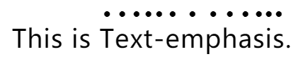
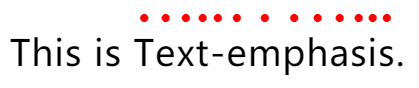
看個簡單的 Demo:
<p>
   This is <span>Text-emphasis</span>.
</p>
p span{
    text-emphasis: circle;
}
text-emphasis: circle 的效果是給包裹的文字��,在其上方�,添加 circle 圖形,也就是圓圈圖形,效果如下:
當然���,默認是黑色的,我們可以在 circle 后面補充顏色:
p span{
    text-emphasis: circle #f00;
}
除了 circle,還提供非常多種圖形可以選擇�,也可以自定義傳入字符���,甚至是 emoji 表情:
<p>
    A B C D
    <span class="keyword">E F</span>
    G H
    <span class="word">I J</span>
    K L
    <span class="emoji">M N</span>
</p>
.keyword {
    text-emphasis: circle #f00;
}
.word {
    text-emphasis: 'x' blue;
}
.emoji {
    text-emphasis: '
