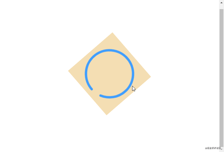
這是 Element UI loading 組件的效果圖��,看起來很酷��,我們來實現一下��!

分析
動畫由兩部分組成:
藍色的弧線由點伸展成一個圓��,又從圓收縮成一個點。

圓的父節點帶著圓旋轉
代碼
html
<svg viewBox="25 25 50 50" class="box">
    <circle cx="50" cy="50" r="20" fill="none" class="circle"></circle>
</svg>
css
默認樣式
.box {
    height: 200px;
    width: 200px;
    background: wheat;
}
.box .circle {
    stroke-width: 2;
    stroke: #409eff;
    stroke-linecap: round;
}
添加動畫效果
/* 旋轉動畫 */
@keyframes rotate {
    to {
        transform: rotate(1turn)
    }
}
/* 弧線動畫 */
/* 125 是圓的周長 */
@keyframes circle {
    0% {
 /* 狀態1: 點 */
        stroke-dasharray: 1 125;
        stroke-dashoffset: 0;
    }
    50% {
 /* 狀態2: 圓 */
        stroke-dasharray: 120, 125;
        stroke-dashoffset: 0;
    }
    to {
 /* 狀態3: 點(向旋轉的方向收縮) */
        stroke-dasharray: 120 125;
        stroke-dashoffset: -125px;
    }
}
.box {
  /* ...同上 */
  animation: rotate 2s linear infinite;
}
.circle {
  /* ...同上 */
  animation: circle 2s infinite;
}
最后把背景去掉

在線代碼演示 https://jsbin.com/yarufoy/edit?html,css,output
到此這篇關于純html+css實現Element loading效果的文章就介紹到這了,更多相關html+css實現 loading內容請搜索腳本之家以前的文章或繼續瀏覽下面的相關文章,希望大家以后多多支持腳本之家�����!
