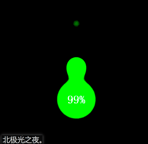
先看效果:
前言:
這個思路是我在b站看up主Steven做的,覺得很不錯,然后自己也弄了一個。(純css)
實現:
定義標簽,有三個水滴盒子,一個圓圈盒子顯示數字,一個最底層盒子:
<div class="kuang">
      <div class="droplet"></div>
      <div class="droplet"></div>
      <div class="droplet"></div>
      <div class="quan"></div>
      <span>99%</span>
   </div>
給最底層盒子基本的樣式。flex布局,這樣3個水滴暫時會垂直居中排列。
.kuang{
            position: relative;
            height: 100vh;
            display: flex;
            flex-direction: column;
            justify-content: center;
            align-items: center;
            background-color: rgb(5,5,5);
            filter: contrast(30);
        }
filter: contrast(30);調整圖像的對比度。值是0%的話,圖像會全黑。值是100%,圖像不變。值可以超過100%,意味著會運用更低的對比。若沒有設置值,默認是1。
水滴的基本樣式。絕對定位,這樣3個盒子會重疊一起。
.droplet{
           position: absolute;
            width: 100px;
            height: 100px;
            border-radius: 50%;
            background-color: rgb(61, 233, 99);
            filter: blur(20px);
            animation: fall 3s linear infinite;
            opacity: 0;
        }
filter: blur(20px);給圖像設置模糊。
重點:我們給水滴盒子模糊度,這然三個水滴盒子會呈現一種模糊的狀態。繼而,我們給底層盒子設置圖像對比度,這樣模糊的圖片會重新繪制輪廓,而得到下面的效果:
給要顯示數字的圓圈基本樣式。記住也要設置模糊度。這樣在圖像對比度下才會有與下落的水滴有融合的效果。
.quan{
            position: absolute;
            width: 100px;
            height: 100px;
            border-radius: 50%;
            background-color: rgb(61, 233, 99);
            filter: blur(20px);
            animation: zhuan 3s  infinite;
        }
給水滴設置動畫,讓它們從上往下落下,期間大小發生變化,這些可以自己慢慢調試,設置成自己認為最好的效果。
 @keyframes fall{
            0%{
                opacity: 0;
                transform:  scale(0.8) translateY(-500%);
            }
            50%{
                opacity: 1;
                transform: scale(0.5) translateY(-100%) ;
            }
            100%{
                   transform: scale(0.3) translateY(0px);
            }
        }
第2和和第3個水滴延遲時間后再播放動畫,這樣3個水滴才會分開下落,至于幾秒可以自己慢慢調試,設置成自己認為最好的效果。
.kuang div:nth-of-type(2){
            animation-delay: 1.5s;
        }
        .kuang div:nth-of-type(3){
            animation-delay: 2s;
        }
給顯示數字的圓圈動畫效果,讓它轉起來。期間可以讓它大小或角度發生或其它變化,具體數值可以自己慢慢調試,設置成自己認為最好的效果。
@keyframes zhuan{
            0%{
              transform: scale(1) rotate(0deg);
            }
            50%{
                transform: scale(1.1) rotate(180deg);
                height: 90px;
                border-top-left-radius: 45%;
                border-bottom-left-radius: 48%;

            }
            100%{
                transform:scale(1) rotate(360deg);
            }
        }
完整代碼:
<!DOCTYPE html>
<html lang="en">
<head>
    <meta charset="UTF-8">
    <meta name="viewport" content="width=device-width, initial-scale=1.0">
    <title>北極光之夜。</title>
    <style>
        *{
            margin: 0;
            padding: 0;
            box-sizing: border-box;
        }
        .kuang{
            position: relative;
            height: 100vh;
            display: flex;
            flex-direction: column;
            justify-content: center;
            align-items: center;
            background-color: rgb(5,5,5);
            filter: contrast(30);
        }
        .droplet{
           position: absolute;
            width: 100px;
            height: 100px;
            border-radius: 50%;
            background-color: rgb(61, 233, 99);
            filter: blur(20px);
            animation: fall 3s linear infinite;
            opacity: 0;
        }
        .kuang div:nth-of-type(2){
            animation-delay: 1.5s;
        }
        .kuang div:nth-of-type(3){
            animation-delay: 2s;
        }
        @keyframes fall{
            0%{
                opacity: 0;
                transform:  scale(0.8) translateY(-500%);
            }
            50%{
                opacity: 1;
                transform: scale(0.5) translateY(-100%) ;
            }
            100%{
                   transform: scale(0.3) translateY(0px);
            }
        }
        .quan{
            position: absolute;
            width: 100px;
            height: 100px;
            border-radius: 50%;
            background-color: rgb(61, 233, 99);
            filter: blur(20px);
            animation: zhuan 3s  infinite;
        }
        @keyframes zhuan{
            0%{
              transform: scale(1) rotate(0deg);
            }
            50%{
                transform: scale(1.1) rotate(180deg);
                height: 90px;
                border-top-left-radius: 45%;
                border-bottom-left-radius: 48%;

            }
            100%{
                transform:scale(1) rotate(360deg);
            }
        }
      span{
          position: absolute;
          color: rgb(184, 182, 182);
          font-size: 26px;
          font-family: 'fangsong';
          font-weight: bold;
      }
    </style>
</head>
<body>
    <div class="kuang">
      <div class="droplet"></div>
      <div class="droplet"></div>
      <div class="droplet"></div>
      <div class="quan"></div>
      <span>99%</span>
   </div>
</body>
</html>
總結:
到此這篇關于html+css實現充電水滴融合特效代碼的文章就介紹到這了,更多相關html 水滴融合內容請搜索腳本之家以前的文章或繼續瀏覽下面的相關文章,希望大家以后多多支持腳本之家!
